Rare Genomics
Rebuilding a nonprofit's digital front door so rare disease patients can actually find help.
- Client
- Rare Genomics Institute
- Role
- Lead UX Designer
- Year
- 2025
- Duration
- 6 months
Context
Rare Genomics Institute is a nonprofit that's spent over a decade connecting undiagnosed rare disease patients with sequencing, analysis, devices, and community. Their website hadn't kept pace: a 10-year-old intro video sat above the fold, key programs were buried, and the design felt frozen in an earlier era of the web. The platform itself (Squarespace 7.0) had reached end of life.
The problem
How might we turn a dated, hard-to-navigate nonprofit site into a clear, accessible front door — one that helps patients, families, and researchers find the right program in seconds instead of giving up?
Approach
Listened to patients and the people serving them
Ran stakeholder interviews with RG's leadership and patient advocacy lead to map goals against real friction. The throughline: families were calling and emailing for resources the site should have surfaced on its own.
Tested the IA, didn't guess at it
Ran Treejack studies across a mix of patients, rare disease experts, and first-time visitors. The original nav left users stuck finding programs; restructured categories (Who We Are, Education, Patient Resources, Community, Stay Updated) tested at 50–85% findability against the old labels.
Let analytics decide what stayed
Pulled six months of Hotjar heatmaps and Google Analytics to see what people actually did. The intro video was almost never clicked; the Rare Disease List was the most-visited page on the site. Used that to rebuild the homepage around what users were already reaching for.
Designed, then shipped on the new platform
Wireframed and prototyped a new homepage and Programs hub in Figma alongside a co-designer, built a refreshed style guide with accessible color and typography, then rebuilt the site page-by-page in Squarespace 7.1 — Squarespace's own converter couldn't handle the size or theme.
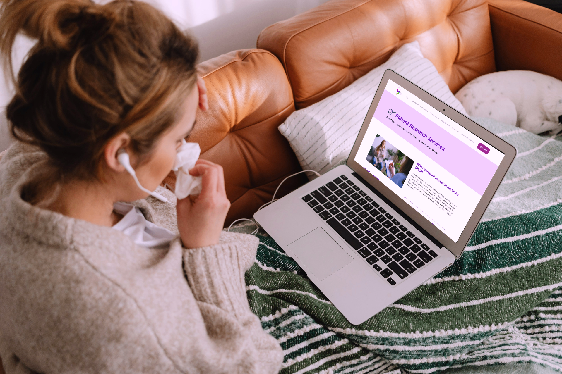
The solution
A modern, accessible Rare Genomics site organized around the four programs patients come looking for — with the dated video and dead-end links replaced by clear paths to apply, learn, and get involved.
A homepage rebuilt around programs
Replaced the decade-old intro video with a concise 'What is RG?' summary and a four-card Programs block (Sequencing, Analysis, Rare Wear, Rare Share) so first-time visitors can self-route to the right offering in one scroll.
Content tuned to real behavior
Added patient success stories, rare disease facts, and an impact overview based on what surveys and stakeholder interviews said was missing. Cut the redundant social block and the second underperforming video, and shortened the Rare Disease List preview while keeping it prominent.
Accessible by default
Built the new design against WCAG using WAVE audits and manual testing — accessible color contrast, modern typography, and clearer hierarchy throughout. Refreshed program logos to give each offering its own visual identity inside a consistent system.
A platform ready for the next decade
Migrated off end-of-life Squarespace 7.0 onto 7.1 by hand, applying the new style guide, standardizing layouts, and adding custom code where Squarespace blocks fell short — so the team can maintain and grow the site without a designer in the loop for every change.
Outcomes
85%
Top Treejack findability on restructured nav
7.0 → 7.1
Full Squarespace migration off an end-of-life platform
↑
Lift in traffic, donations, and program applications from interim SEO + content fixes
Reflection
Working on the Rare Genomics website reminded me that for mission-driven orgs, a website isn't a brochure — it's the difference between a family finding help and giving up. The most impactful design decisions weren't visual; they were editorial and architectural: cutting what wasn't working, naming things the way users named them, and trusting the analytics over assumptions.
Keep exploring